The relationship between words and pictures is one of understatement.
Much of the humour in the story develops from this as the images defy expectation, and all weird absurdities are greeted with a kind of casual disinterest from the narrator. Such a tone is consistent with the themes of the book, which deals with questions of apathy, particularly the suppression of imagination and playful distraction by pragmatism and bureaucracy, conditions that affect both a society and its individuals.
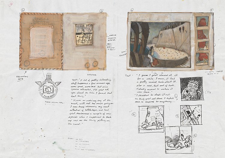
Shaun Tan, Page Layout Sketches with Draft Text of The Lost Thing, 1999, Shaun Tan Collection, Reproduced with Permission
Visually, the book is quite dense, which reflects the environment it depicts, having a sense of congestion and compression. There are no empty spaces on the pages, with all images framed by a collage of text and diagrams cut from old physics and maths textbooks. These were used by my Dad when he was an engineering student, and largely inspired much of the book’s aesthetic; they add some sense of the dry and industrial world presented in the paintings, a sort of meaningless functionality - pointless and amusing also. There is an accidental ‘poetry’ that often occurs using collage, where a chapter heading in an engineering manual might pass as an unintentional comment on life. The bottle-top collection, made from many beer bottle-tops (supplied by my house-mate), seems to perfectly sum up the universe in an abstract way - just right for an endpaper design.
I also liked the idea that, in keeping with the first-person narrative, this book is somehow a product of that world. Stamps and signs marking the cover and title pages, for example, “The Federal Department of Information”, are consistent with the society the narrator comes from, along with other incidental details throughout the book which collectively build a sense of the place in the absence of any overt description by our story-teller.
The Lost Thing itself I always knew would be red and big, so very noticeable, which makes us wonder why nobody really notices it (this is the key question of the story, for which there is no single answer). Its design was based on a pebble crab, a small round crustacean with claws that hinge vertically, and I combined this with the look of an old-fashioned pot-bellied stove, with a big lid on top instead of a mouth. I did not want the creature to have any anthropomorphic features, especially no face, so its eyes are reduced to small dots which emerge from a hole. The main thing was that it looked strange and unrecognisable - which is not always easy.
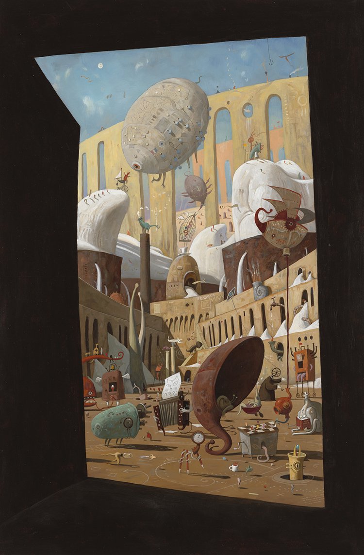
Shaun Tan, Artwork for The Lost Thing: Utopia, 1999, Shaun Tan Collection, Reproduced with Permission
The creature exists in contrast to the world it inhabits, being whimsical, purposeless, out-of-scale and apparently meaningless - all things that the bureaucracy cannot comprehend, and so it is not worthy of any attention. Being a curiosity is only effective if the populace is curious, and they aren’t, being always “too busy” doing more important things.
There is perhaps some suggestion that the creature is an accidental by-product of the industrial landscape, a sort of unconscious mutation, appearing on the beach as if ‘washed up’. Towards the end of the book we notice that while the lost thing may be unique, it is not alone - evidently weird creatures regularly appear in the city, but their presence can be measured only by the extent to which they are noticed (i.e. generally not at all). What these things are exactly should be a broad and open question for the reader, given that they symbolise some fairly open-ended notion of ‘things that don’t belong’.
See original illustrations from The Lost Thing in our exhibition Story Time: Australian Children's Literature.
Read more from Shaun Tan on his website.

